Cottage Kitchen with Contemporary Accents
This contemporary kitchen design is functional and stylish and fits seamlessly into this Client’s craftsman Phinney home.

This contemporary kitchen design is functional and stylish and fits seamlessly into this Client’s craftsman Phinney home.

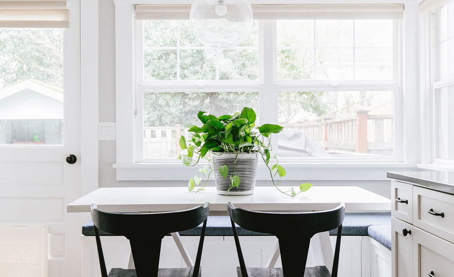
This contemporary kitchen design was developed by fully opening up the kitchen space to maximize light and flow throughout the space. We started by removing a large, decommissioned chimney, which ran along the East wall and bumped into the kitchen space. Once we removed the chimney, we had a long, flush wall that we could use for the stove cabinetry and much needed countertop/prep space. The original kitchen design had lower and upper cabinetry that divided the room, creating a small eat-in area by the windows. We removed this cabinetry and installed a built-in nook, which maximized the space available and allowed for more light exposure throughout the kitchen. Oak flooring was installed and stained to match the rest of the original oak flooring on the main floor. White shaker cabinets, dark countertops, nickel fixtures and a marble mini hex backsplash were combined to create an elegant look. The walls were painted Benjamin Moore Gray Owl. The Sollera cabinetry was designed by Phinney Ridge Cabinet Company. Black accents like hardware pulls from Rejuvenation were sprinkled throughout for a bit of drama. Gorgeous, light filtering roller shades from The Shade Store were added in a natural fiber for privacy. This contemporary kitchen design is both functional, stylish and fitting with this Client’s craftsman Phinney home. I personally love the feel of this space because it’s so welcoming – especially on a sunny day with light streaming in through the windows!
Becky held my hand through a complete kitchen remodel. From helping me figure out what I wanted in the space, to creating an idea board, guiding me through decisions big (cabinets) and small (knobs and pulls), connecting me with vendors, she was instrumental every step of our major redesign. She's terrific and I highly recommend her! I can't wait to work with The Phinery again.