Our Favorite Pink Paint Colors & How To Use Them
August 17, 2022
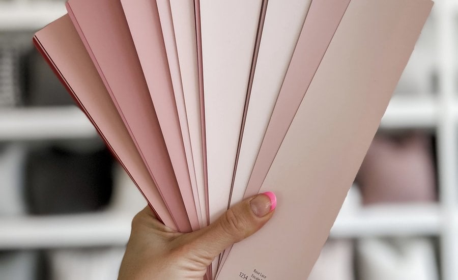
THE PHINERY’S FAVORITE PINK PAINT COLORS & HOW TO USE THEM
The color pink is essential at The Phinery (as evidenced by our signature pink rustic doors at the studio!). We have a long list of our favorite pink paint colors that we are so excited to share!
Pink paint color can be a game changer in your home, it just depends how you want to use it. For example, blush hues can act as subtle neutrals, or as a bold pops of color to add personality and life to your space. They key is, decide what look you’re going for and do some research on undertones. Gray undertones will leave you will a cool, muted shade while yellow undertones will produce a brighter, warmer color.
We love using paint color to transform our client’s homes. Selecting the right paint color and deciding how and where to use it is vital in creating a space that is a reflection of you; a place that feels like home. Adding paint color to you entry way might allow your home to feel more welcoming. Perhaps painting your lower kitchen cabinets in a new shade will add just the right amount of charm to your cooking space. In the spirit of Valentine’s Day we decided to share our favorite shades of pink and some of unique ways to use this hue in your home. Whether you are seeking a hyper-feminine look, or something more subtle, we have tons of fun ways to add pink to your home.
Benjamin Moore’s Wild Aster 1240
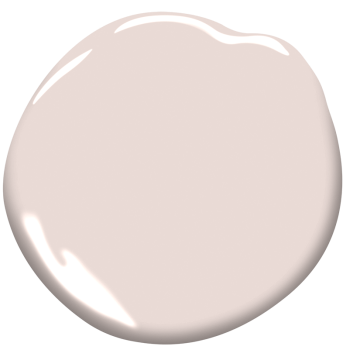
A staple color at The Phinery, Wild Aster has pale gray undertones that make it subtle and beautifully refined. We recommend using this muted pink hue as a soft pop of color on doors or cabinets, or for an entire room if you’re hoping for a bigger impact.
Below, you can see Wild Aster applied as an accent color on The Phinery’s iconic vintage studio doors. This color pairs perfectly with deep jade, as shown here with Benjamin Moores Narragansett Green on built-in storage cabinets.
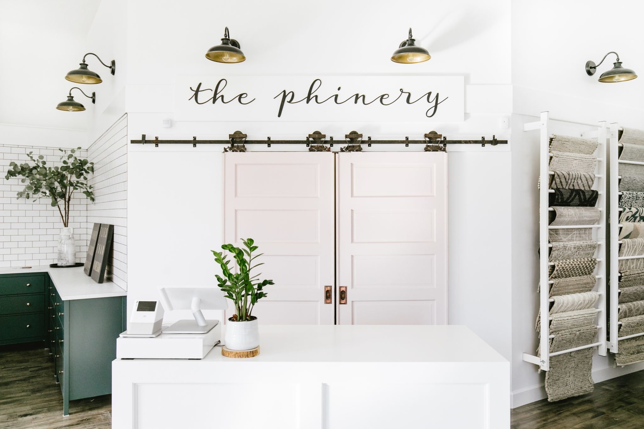
Photo by Meghan Klein
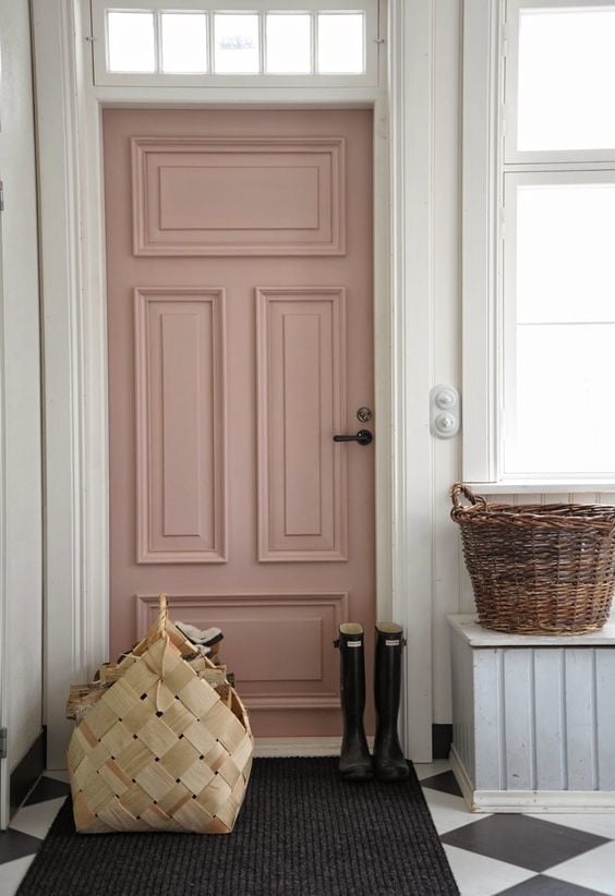
Benjamin Moore’s Rose Bisque
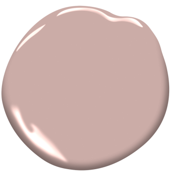
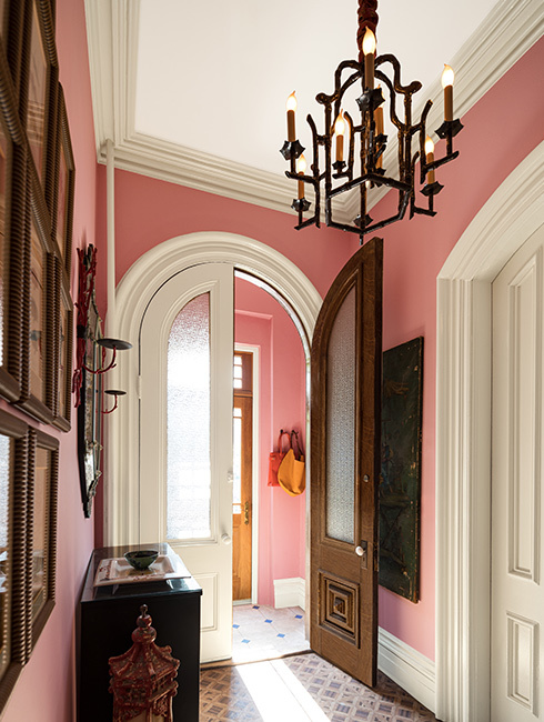
Rose Bisque is a rich, dusty pink with beautiful depth. This color is elegant and ultra-sophisticated, perfect for accenting intricate wood details and special architectural moments…think coved ceilings, decorative wall paneling, vintage details etc. If you are looking to avoid the ‘millennial pink’ trend, this is the pink for you. Rose Bisque is truly timeless. This color is gorgeous paired with deep charcoal textiles or black hardware. See it used here as an alluring door color.
Benjamin Moore’s Fairest Pink 2092
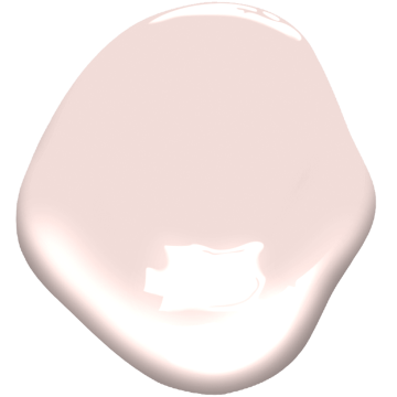
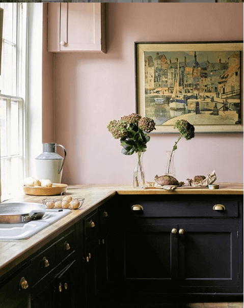
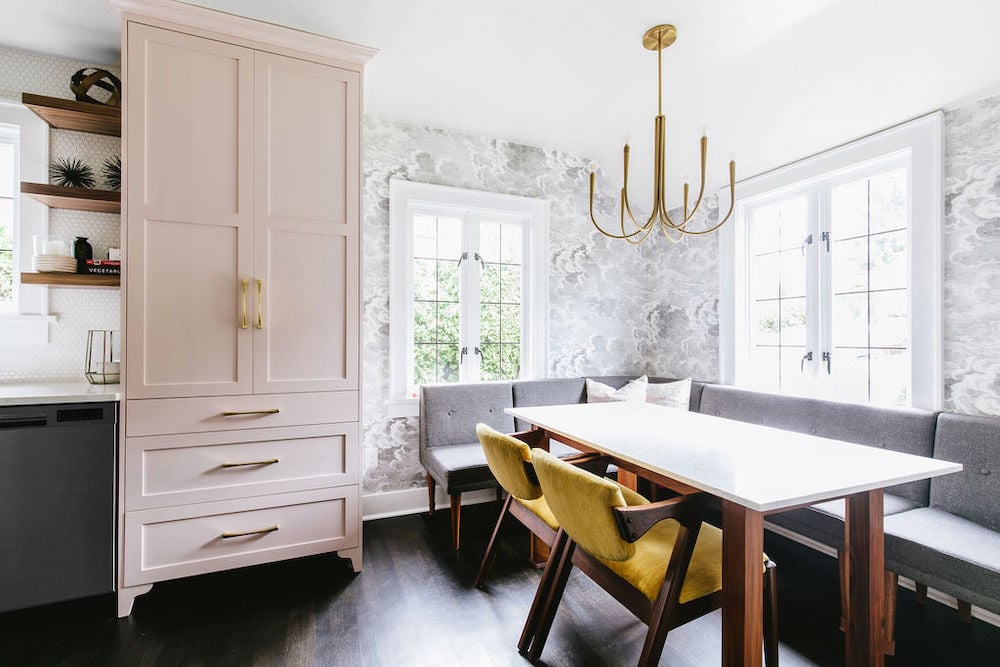
Fairest pink is more saturated and punchy than our subtle Wild Aster, but pastel enough to blend seamlessly into more neutral decor. We LOVE how this color turned out on a custom cabinet paired with shiny brass hardware. It adds just the right amount of interest to this vintage glam kitchen in our client’s home (below). This hue is fun, youthful and brings a ton of life to this mid-century inspired kitchen nook.
Benjamin Moore’s First Light 2102-70
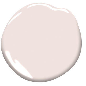
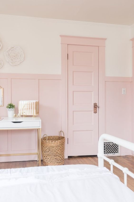
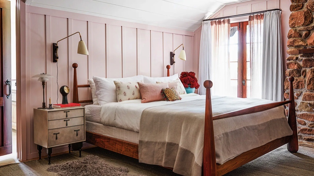
ne of Benjamin Moore’s 2020 colors of the year, First Light has plenty of warmth, making it very versatile. This color can truly be used anywhere: bedroom walls, accent doors, cabinetry etc. This cheery shade couples beautifully with warm wood and natural materials like jute and rattan. We love seeing First Light on board and batten in a charming bedroom to create an interesting and cozy space. (below)
Benjamin Moore’s Gypsy Pink 2077 – 20
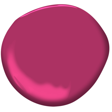
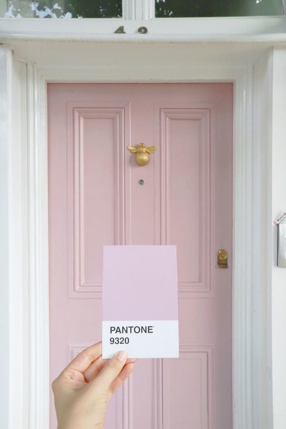
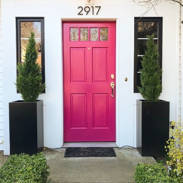
Our favorite place for Gypsy Pink is the front door – it is an absolute show stopper. Bright and bold, this hue adds serious personality to the exterior of your home. If you are hoping to make a striking statement, this is the color for you.
See it paired with a classic black and white exterior color scheme and brass hardware below.
Benjamin Moore’s Venetian Portico AF – 185
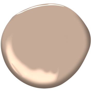
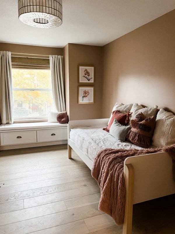
One of Benjamin Moore’s 2022 Colors of the Year, Venetian Portico is a lush, earthy shade of pink. This color is incredibly grounding and pairs well with warm neutrals like ivory, oatmeal and camel. This color can lean boho or classic, it all depends on how you style it. Antique brass accents and creamy textiles take this color to the next level.
We love Venetian Portico as an option for a kids bedroom (below); it will mature gracefully along with your kiddo and can easily transition to a guest room or office down the road.
Here are some pink spaces we cant get enough of:
