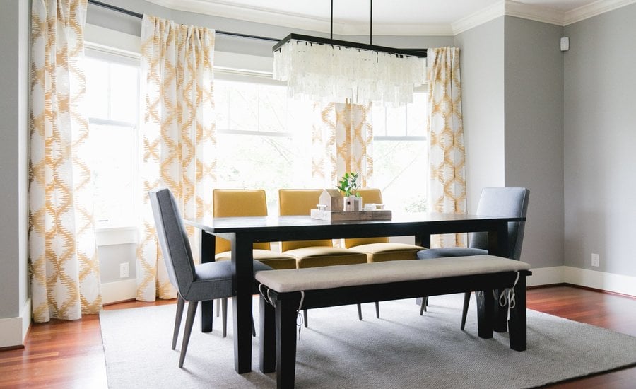
Light & Bright Formal Dining Room
This classic dining room is brought to life with pops of yellow, mixed seating and a gorgeous chandelier.

This classic dining room is brought to life with pops of yellow, mixed seating and a gorgeous chandelier.

One of the major challenges in this space was selecting colors that would coordinate with the wood floors, which have very red undertones. We were very intentional with every decision, including paint colors, textiles and furniture. For the most part, we went with cool, neutral tones to offset the warmth of the floors. Soft gray walls really calm down the space. We definitely incorporated some color, but we stayed away from reds, pinks, and orange in order to ensure the space looked bright and fresh.
When we first began working with this client, there was no furniture or decorative lighting in this space at all. When looking at the floorplan of this home, it was clear that this area would be the dining space but because it is a pass-through room (open to both the kitchen and living room) we needed to get creative with how to define the space. A key part of this was lighting. We installed a statement-chandelier to help define the dining area and create visual interest above the dining table. Another key element here is the drapery panels. Our client really wanted a very ‘designer’ look and we achieved this with some beautiful printed draperies. They add pattern, color and most importantly, visual weight, to the room, further carving out a defined area within the larger space.