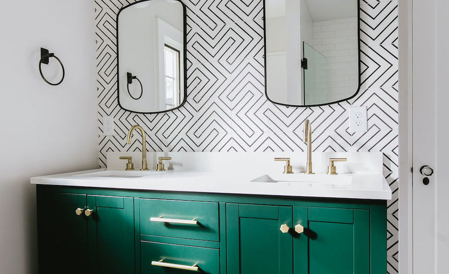
Emerald Maze Bathroom
This gorgeous primary bath is full of color, pattern and personality.

This gorgeous primary bath is full of color, pattern and personality.

This design was so much fun because our clients were really looking for something unique and interesting in their primary bath. They wanted bold color and pattern and to put their own personal twist on this home. The starting point for the entire look was the backsplash tile. We went with a graphic black and white that would set the tone for the whole space. Before installing the tile, we spent about an hour mapping out exactly how we wanted it installed.
There are generally multiple configurations you can lay your tiles in so it is key to know which configuration you want to go with before the install day. From there, we went to the floor tile. Because the black and white tile behind the vanity had so much going on, it was really important to select something for the floor that was understated but still unique. We selected a dark gray chevron with matching grout which was the key to avoiding a ‘busy’ look.
When it came to selecting a vanity, we knew this was our opportunity to incorporate color. It was important to the client to find something that was ready-made to save on costs, but still had a custom look. We landed on this gorgeous emerald green vanity by Anthropologie. We put our own spin on it by switching out the hardware which helped us achieve a custom look that was important to the homeowners.
One of the really unique parts of this bathroom is the mixed metal finishes. We didn’t want the space to feel too glam or too heavy so achieving a balanced mix of both metals was our approach. Shiny brass and matte black work in unison to create a very eclectic but still highly refined look. The black mirrors appear as if they are almost part of the tile background and allow the brass light fixtures and faucets to stand out and act as the ‘jewelry’ in this space.
Becky was great at guiding me - we built some gorgeous rooms that all have a mixture of classic timeless elements and with layers of whimsical prints and pops of color. When people first see our home, the reaction is SO GRATIFYING. So many oooohs and aaaahs - it makes me smile from ear to ear every time. Better than that, I still find myself, four years later, scanning my home and letting my eyes take in all the lovely elements in each space. It truly brings a sense of calm and joy to me every single day - it's a feeling I hope every person has the opportunity to have about their home!