The Phinery’s Favorite Cabinet Colors
July 26, 2022
The Phinery’s Favorite Cabinet Colors
Bold cabinets are having a big moment in the world of interiors and we hope it’s here to stay. Of course, we love a clean white kitchen, but adding a pop of color, or even a rich neutral, can round out your space and make it feel so much more grounded. It is also a great way to infuse personality into your home. Whether your kitchen cabinets need a face lift, or a set of built-ins could use a refresh, adding color is a great way to do it. We compiled our list of The Phinery’s favorite cabinet colors – keep reading!
Vermont Slate 1673
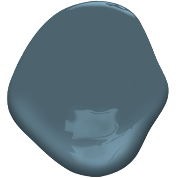
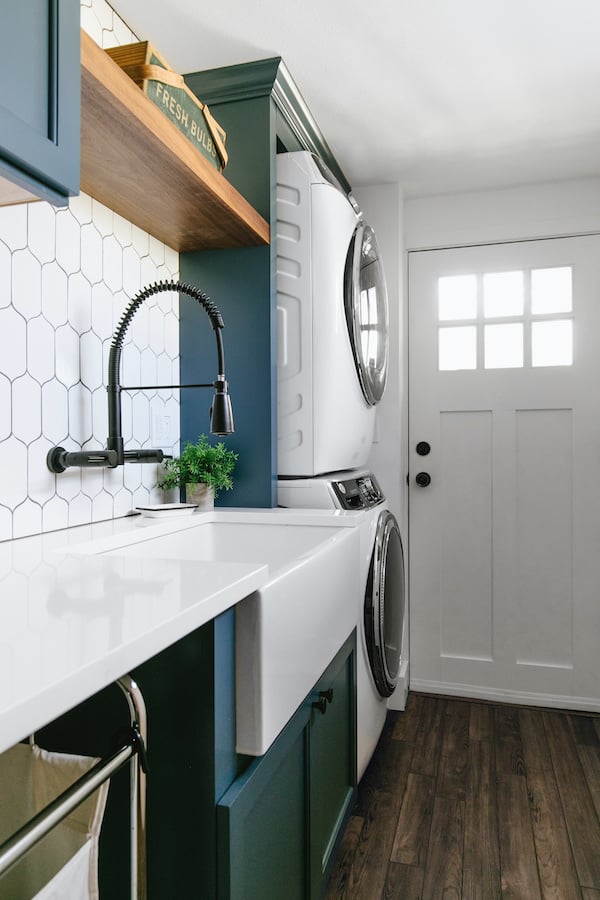
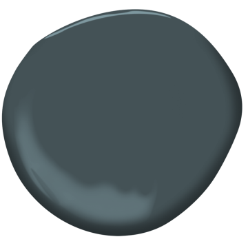
Sophisticated and strong, Vermont Slate is the perfect way to add a handsome element to any room. This rich blue shines in both traditional and modern spaces. We love it on a kitchen island or as an unexpected pop of color in a small space like a powder bath or laundry room. It is pictured below in our Modern Farmhouse Laundry Room Project. We paired it with white tile and countertops, a stained wood shelf, dark wood floors and black hardware for a super fresh, modern look.
Hale Navy HC – 154
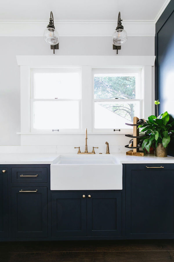
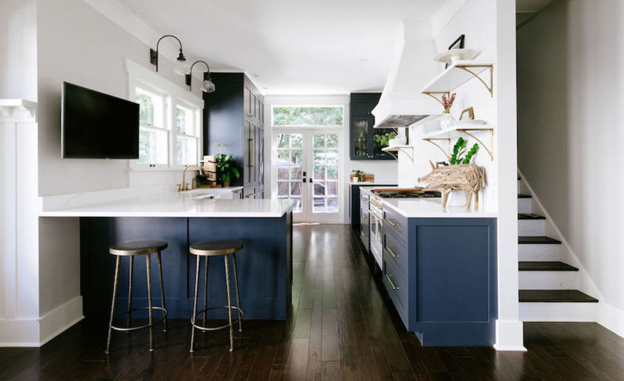
A part of Benjamin Moore’s Historic Collection, Hale Navy is a timeless shade of navy blue that will never go out of style. This color is truly a classic. Dark and saturated, it pairs beautifully with light gray walls and soft white trim. See it pictured below in the home of The Phinery’s principal designer and owner, Becky. She expertly selected brass hardware and white countertops to create great contrast while also preserving the timeless charm of the cabinet color. For Becky’s kitchen cabinets, she took Hale Navy a few shades darker to deepen the tone. This is a great tip when finalizing paint color for your home. You can work with your paint store to slightly adjust colors (lighter or darker) so that they integrate more seamlessly into your space.
Fairest Pink 2092-70
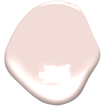
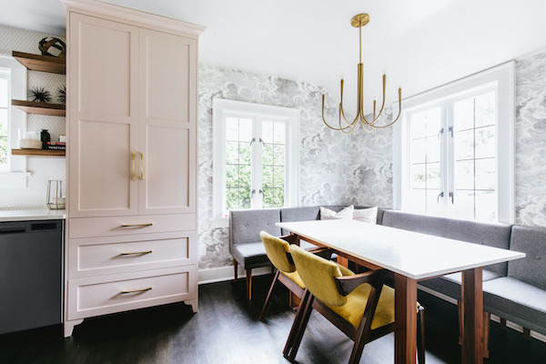
Soft yet cheery, Fairest Pink is a beautiful choice for adding a bit of femininity to a room. We love using it as an accent against other richer colors like charcoal gray or in combination with deep wood tones to play up the warmth. Pictured below in our Vintage Glam Kitchen project, a Fairest Pink cabinet is made even more dreamy with brass hardware and a statement chandelier. This color is gorgeous next to monochromatic wallpaper – it makes this breakfast nook feel welcoming and playful.
Iron Mountain 2134-30
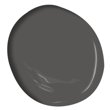
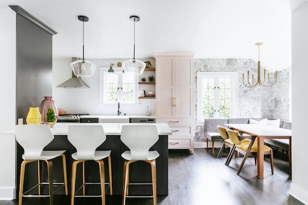
Iron Mountain is all about depth. This charcoal gray is one of our favorites when we need to add contrast to a space. Iron Mountain is a great neutral for kitchen cabinets if you have other warm neutrals in your home. For a slightly lighter look, this shade would be beautiful on lower cabinets with white uppers or open shelves. In our Vintage Glam Kitchen project, Iron Mountain acts as a grounding force in the kitchen/breakfast nook space. Whimsical wallpaper and a light pink cabinet, fun as they may be, required something striking to add contrast and balance the room. The end result is airy and artful with just the right amount of drama – supplied by the deep charcoal cabinets.
Nightfall 1596
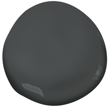
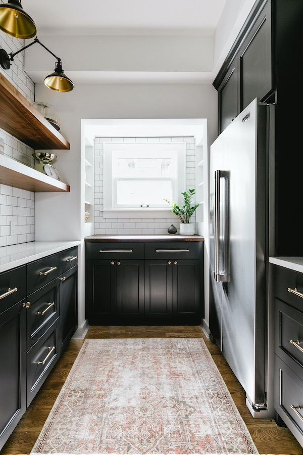
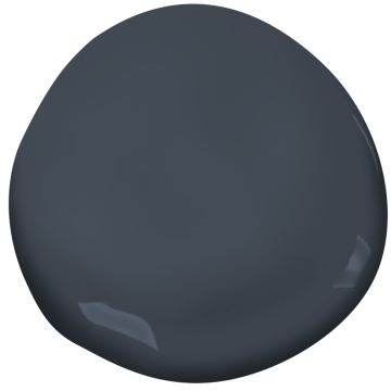
This blackened gray is a favorite for creating high-drama spaces. Its a super high-impact charcoal that, although very saturated, reads softer than stark black. Nightfall is stunning in our Modern Farmhouse Walk-In Pantry project, pictured below. White countertops and subway tile work together with warm wood floating shelves to keep this space from looking too heavy and dark. Brass accents and a vintage-inspired distressed rug add beautiful warmth to the space.
Narragansett Green HC-157
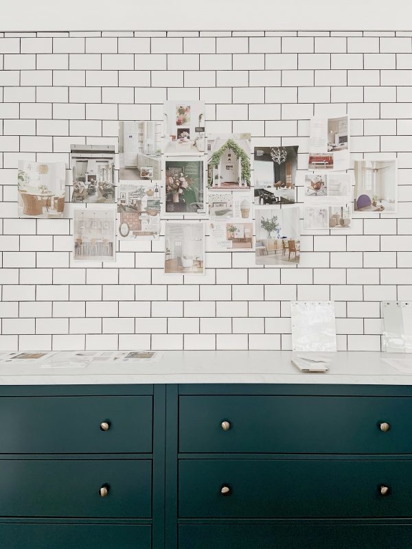
The ultimate jewel tone, Naragansett Green is a Phinery obsession. Our team loved this color so much, we decided we had to have it in our studio! In the photo below, you can see it elegantly gracing the cabinets in our design library. Coupled with white countertops and white subway tile, Naragansett Green adds an essential element of depth to the space. We selected brass knobs for a super elegant finished look. The great thing about this color is its versatility; depending on what it is surrounded by, it can read green, blue and even a bit gray. If you are looking to make a bold statement, this one’s for you.
Choosing a cabinet color can be difficult, but don’t let that stop you from having fun and going bold! Pro tip: sample your paint colors before starting your project. Make sure you observe your swatches at different times of day so you can see how they read in different kinds of light. There is really no way to know how paint will read in your space so we always recommend testing first.
Need help picking the perfect paint colors for your Seattle home? Book a Consult.