3 Tips To Make The Most Of A Small Space
June 20, 2022

Every home has at least one awkward, unused space that can be tricky with which to work. To us, these areas present a fun design challenge! Many of our clients express that they need help making these types of small spaces functional (and beautiful) so we decided to share a few of our favorite small space design ideas to help you reimagine your own small space challenge.
1. PLAY WITH PATTERNS
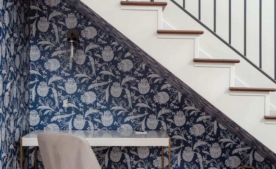
Many of our clients express hesitancy about wallpapering a petite space for fear it will look too busy; however, the right wallpaper can actually make a space look intentional and give it a life of its own. This punchy indigo print gives a stairwell cavity in our AirBnb Apartment Project an entirely new feel. Adding a petite desk made this space into a creative hideaway and functional workspace instead of an empty, unused cavity.

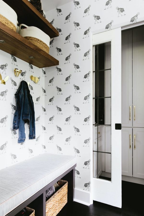
Black and white ostrich wallpaper transforms a pass-through side entryway into a total design moment in our Vintage Glam Kitchen project. A built-in bench with storage both above and below maximizes the manpower of a small nook and creates an area that is super functional for this family of four. Whimsical brass hooks and cheery wallpaper give this space a purposeful look, and beckons the kiddos to drop their things before dashing to the kitchen table for dinner.
2. DESIGN FROM BOTTOM TO TOP
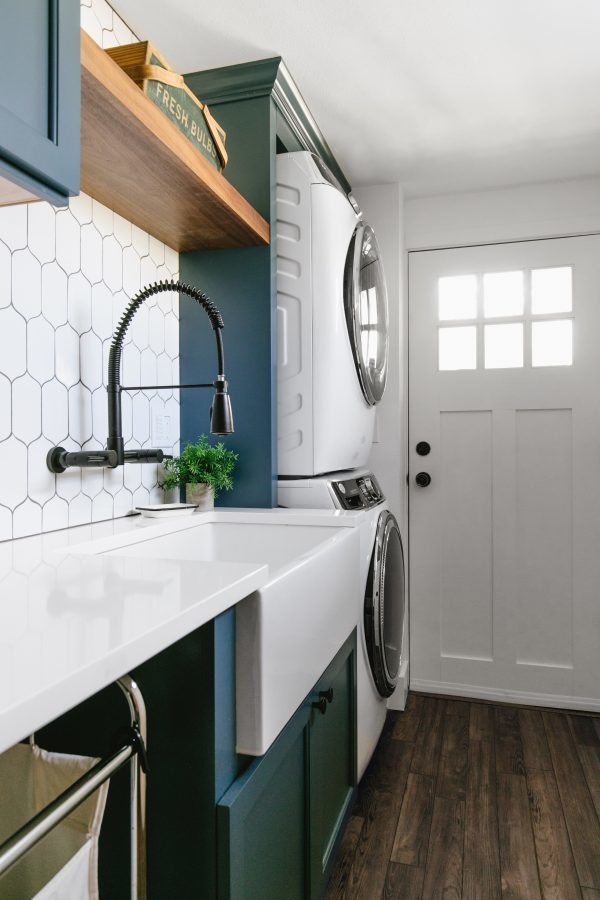
Don’t be afraid to use the entire space and ‘go high’ with design elements and decor. If your space has a small footprint, going big with your wallpaper is a great idea. The laundry room in our Modern Farmhouse Laundry Room project (below), is long and narrow so we made the most of this slender space by taking the built-in cabinets all the way to the ceiling and finishing with a crown molding. Not only do the cabinets go from floor to ceiling, so does the backsplash tile. Bringing your design all the way to the top of the room draws your eye up and helps the space appear taller and more spacious.

Artwork and lighting are also great tools to help create the illusion of a grander space. Consider using your vertical space to assemble a gallery wall showcasing artwork that nearly reaches the ceiling. This draws attention to the height of the room, creating a more expansive appearance. The dining room below is an excellent example of how using vertical and diagonal lines, through both artwork and lighting, guides your eye upwards, making the room feel larger and more airy.
3. GO BOLD WITH COLOR
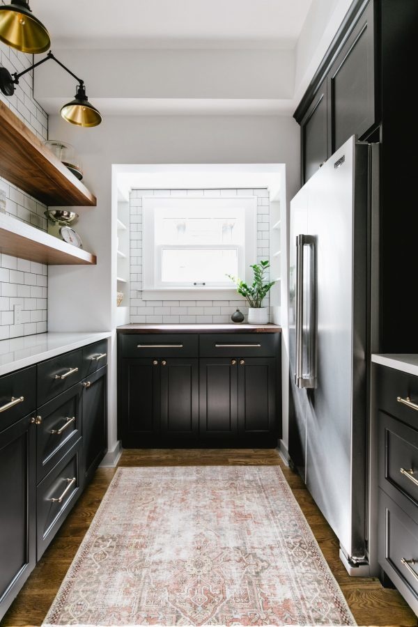
The prospect of painting cabinetry in a walk-in pantry deep charcoal may initially seem like a color choice that would have overwhelmed such a tiny space. However, white paint, white subway tile and warm wood floating shelves work together to balance all the components in this room, leaving the charcoal paint to shine. A rich paint color choice makes this small space feel incredibly elegant. A distressed rug is the cherry on top, adding an element of comfort and warmth to this heavy contrast pantry. See the full project here.

You might be afraid that a dark paint color will make your room feel smaller. When done right, rich walls can add depth to a space making it appear larger. This charcoal powder room is a great example. The ultra moody hue creates an effect where the walls almost appear to recede, making the room feel much larger. Dark walls are great for creating drama but it is important to remember that both your lighting and finishes need to reflect the mood as well! You’ll notice ultra sophisticated light fixtures and an oversized mirror in this luxe bathroom. Going dark on your walls works best when there is a natural light source in the room.
We hope these tips help you create beautiful designs, even in your smallest of rooms. If your space needs a little extra attention, book a consultation with one of our amazing designers.